KIIHA
- BRANDING
- LOGO
- GRAPHIC
- PHOTOGRAPHY
SINCE 1996
 TOKYO, JAPAN
Close
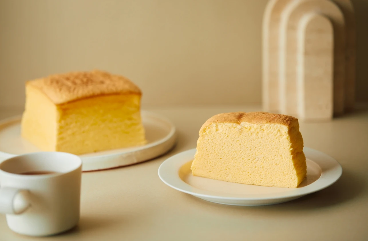
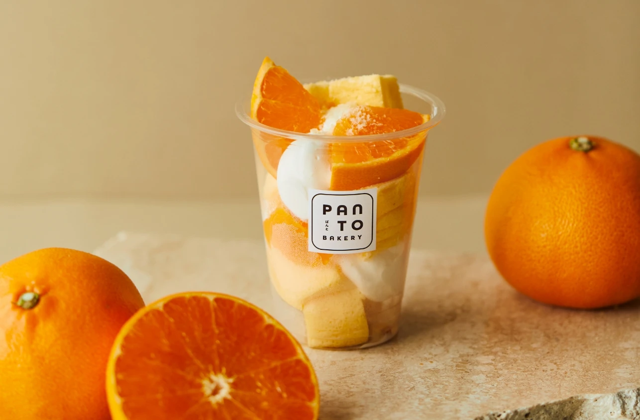
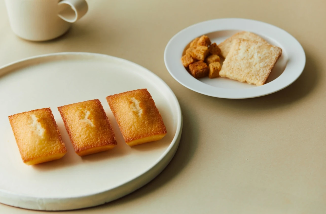
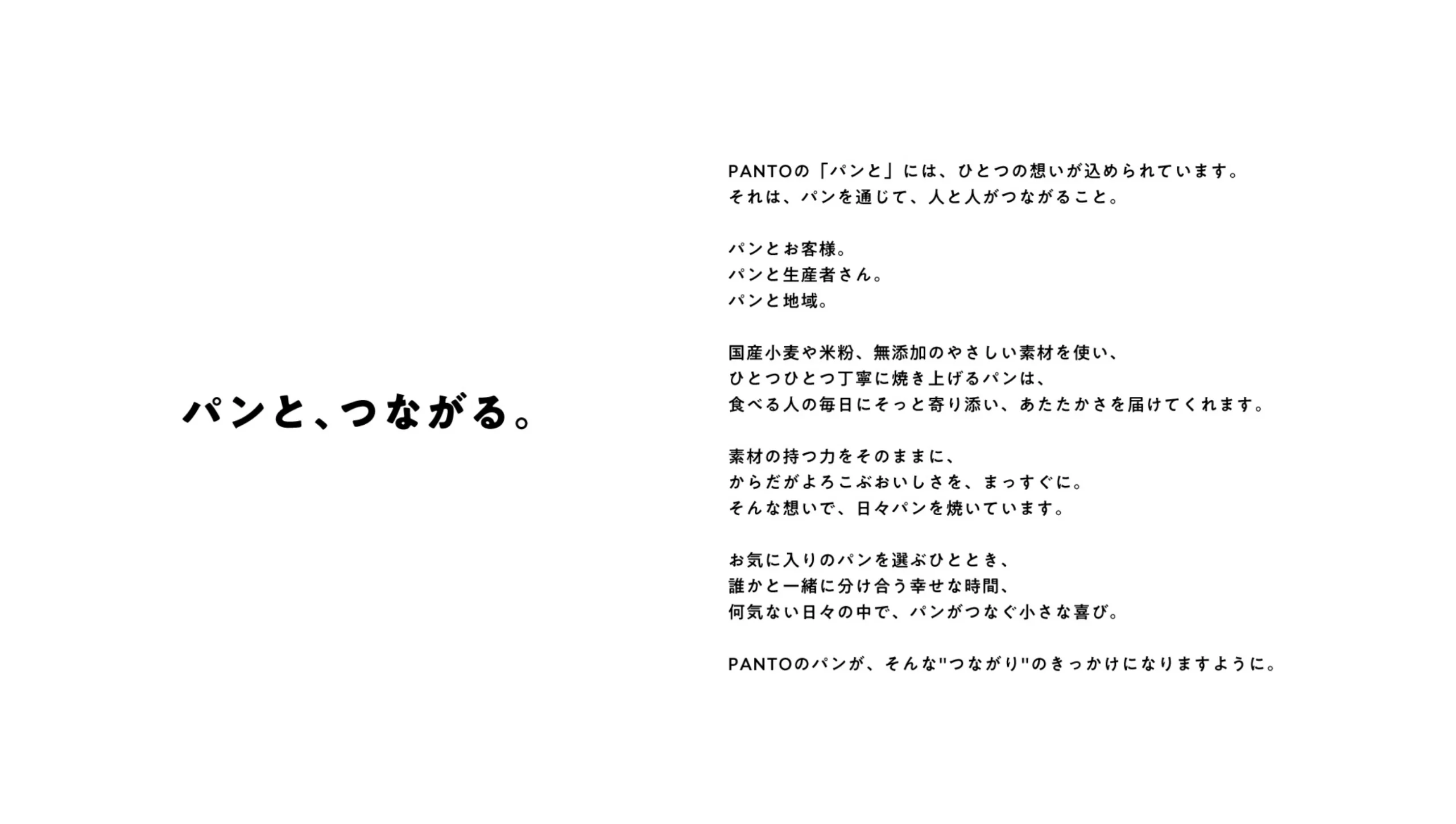
地域に根ざしたベーカリーブランド「PANTO」の立ち上げにあたり、ブランドコピー、ロゴ、ビジュアル設計など、ブランディングの基盤づくりを担当しました。パンを通じて、人と人、地域と日常をつなぐというブランドの思想を、言葉と造形に込めています。
We were responsible for building the brand foundation of “PANTO,” a bakery brand rooted in the local community. Our scope included the development of the brand copy, logo design, and visual direction. The brand’s philosophy—connecting people, communities, and everyday life through bread—is expressed through words and form.
地域に暮らす人々の、日々の営みにそっと寄り添うようなパン屋をつくりたい。そんな静かな願いから、PANTOのブランディングは始まりました。クライアントが抱いていたのは、「パンを届ける」こと以上に、パンを通じて人と人、人と土地をつなぐこと。小さな店舗を起点に、関係性やぬくもりがじんわりと広がっていくような、やわらかくて、力強いビジョンが根底にありました。ブランドコンセプトには、「パンと、つながる。」というコピーを提案。パンを囲む時間や香り、空気が、人のこころを静かにつなぎ直す。それは、日常の中で気づかぬうちにこぼれていた豊かさを、もう一度思い出させてくれるような体験だと私たちは捉えました。
The branding of PANTO began with a quiet, heartfelt wish: To create a bakery that gently accompanies the daily lives of the people who live nearby. What the client envisioned was more than simply delivering bread. It was about creating a place where bread could serve as a medium—connecting people to one another, and people to the land. From this small store, relationships and warmth would ripple outward, softly but surely. We proposed the brand concept: “Connecting through bread.” The time spent around bread—the aroma, the shared moments, the presence—has the quiet power to reconnect people. To us, it felt like a way to rediscover a kind of richness we tend to forget in the flow of everyday life.
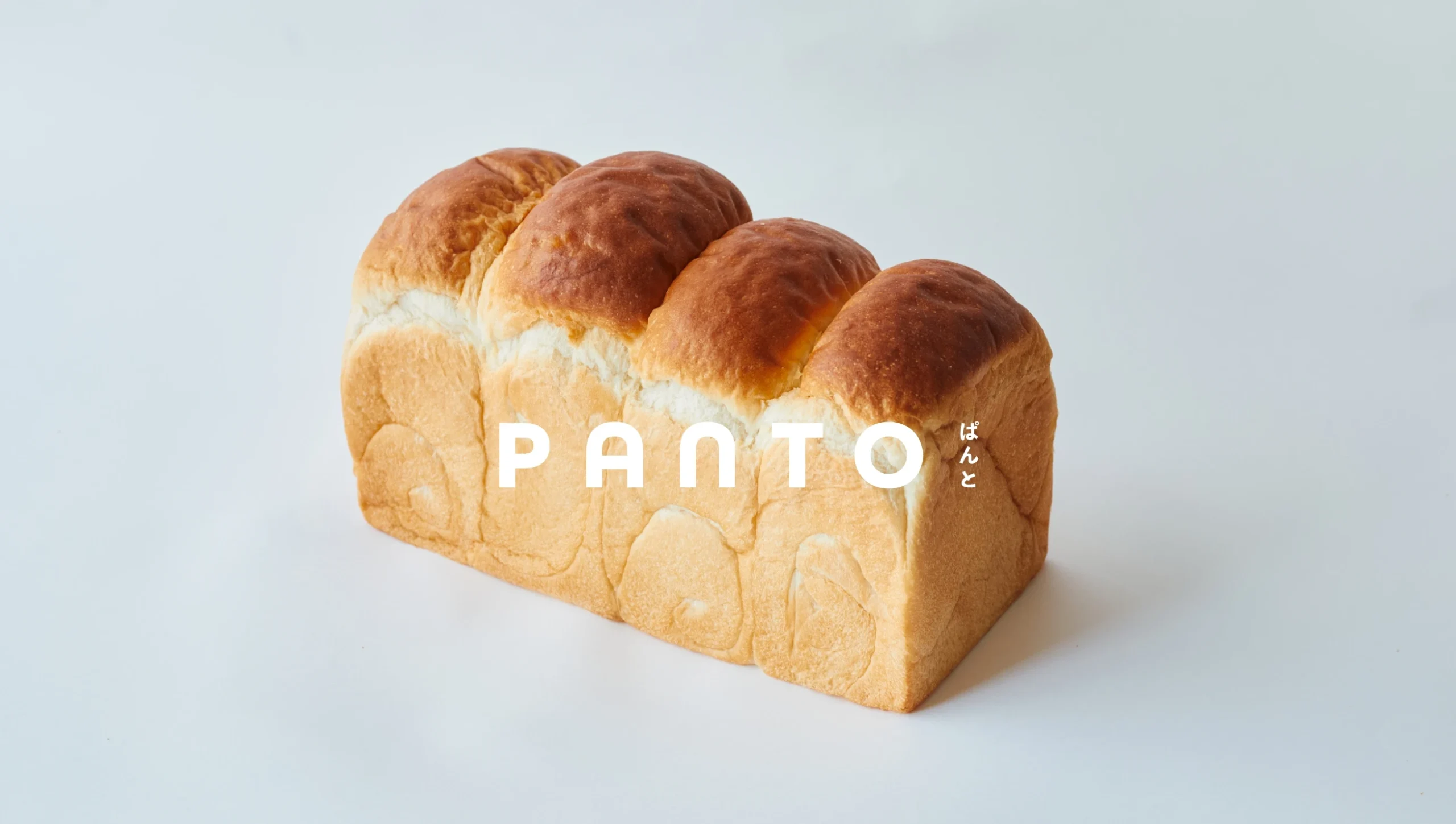
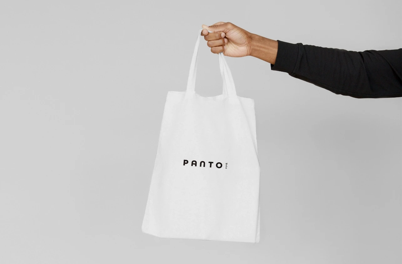
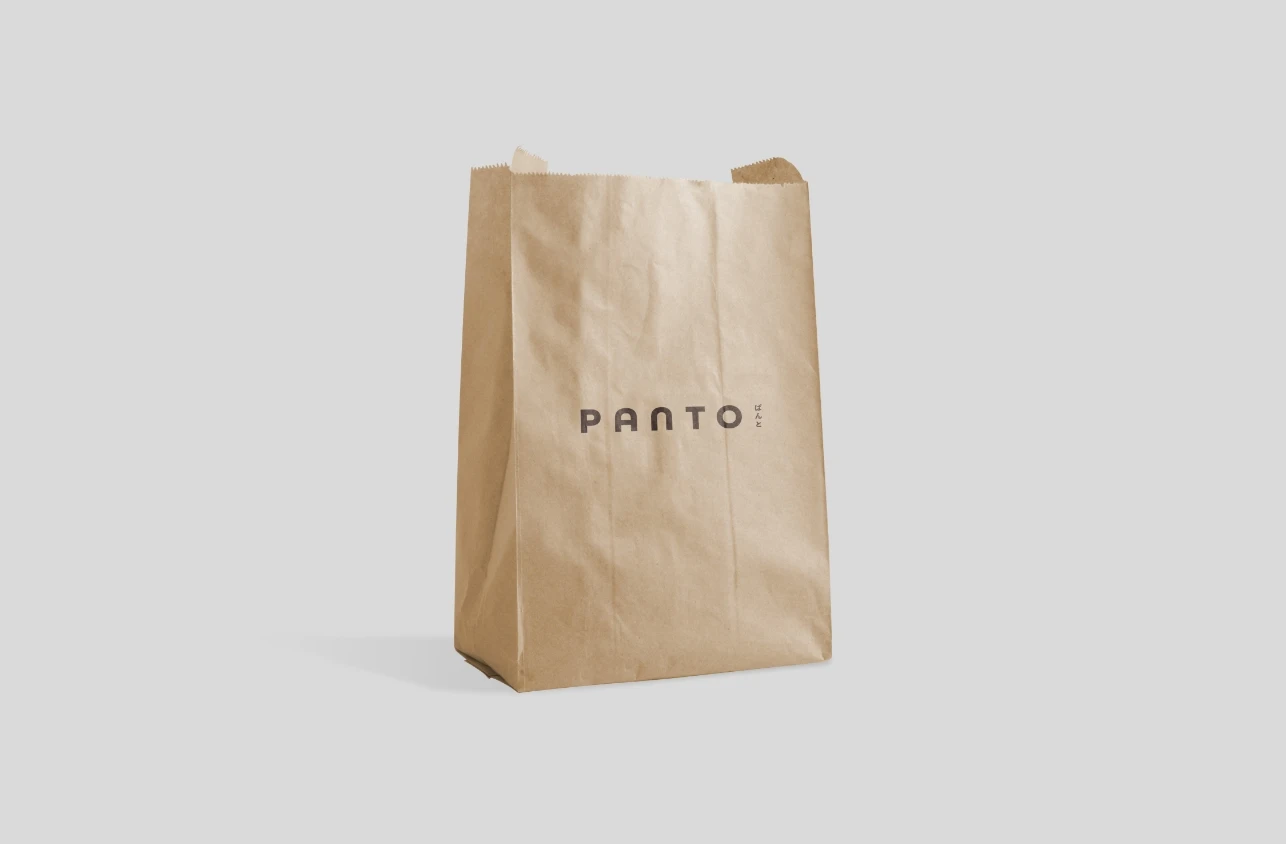
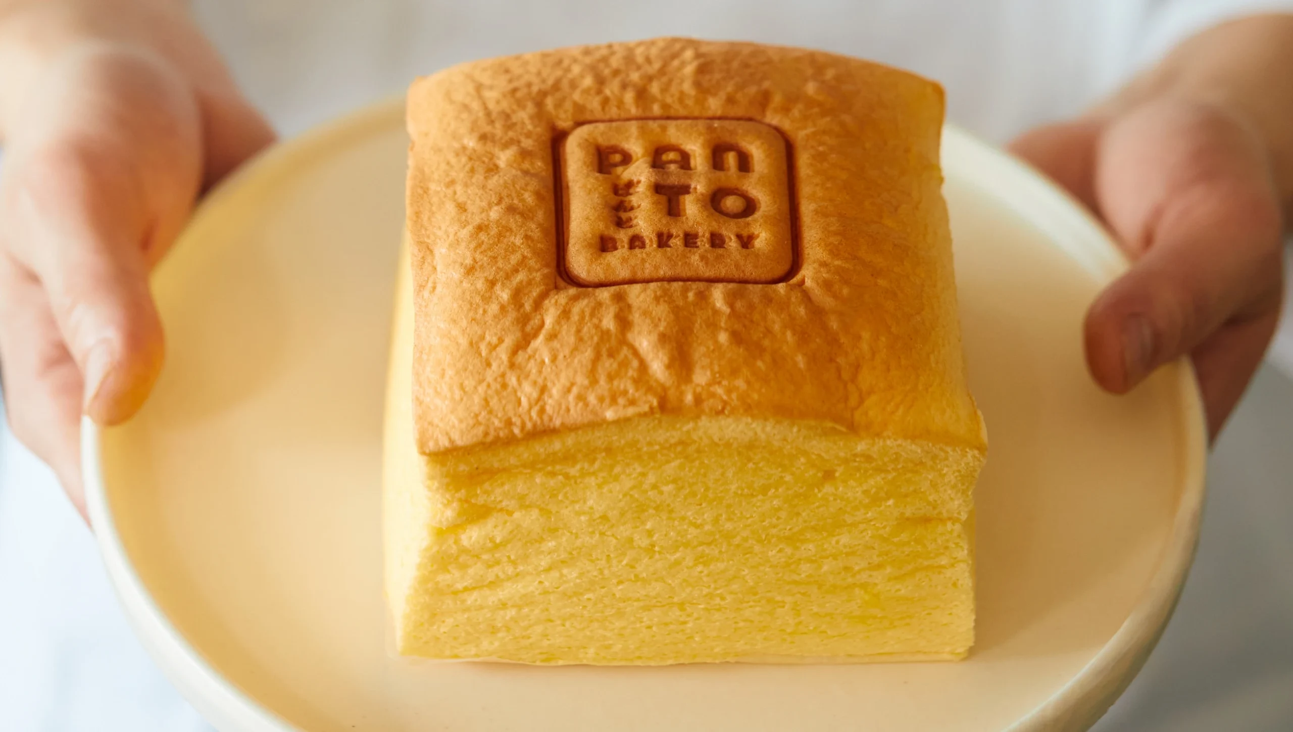
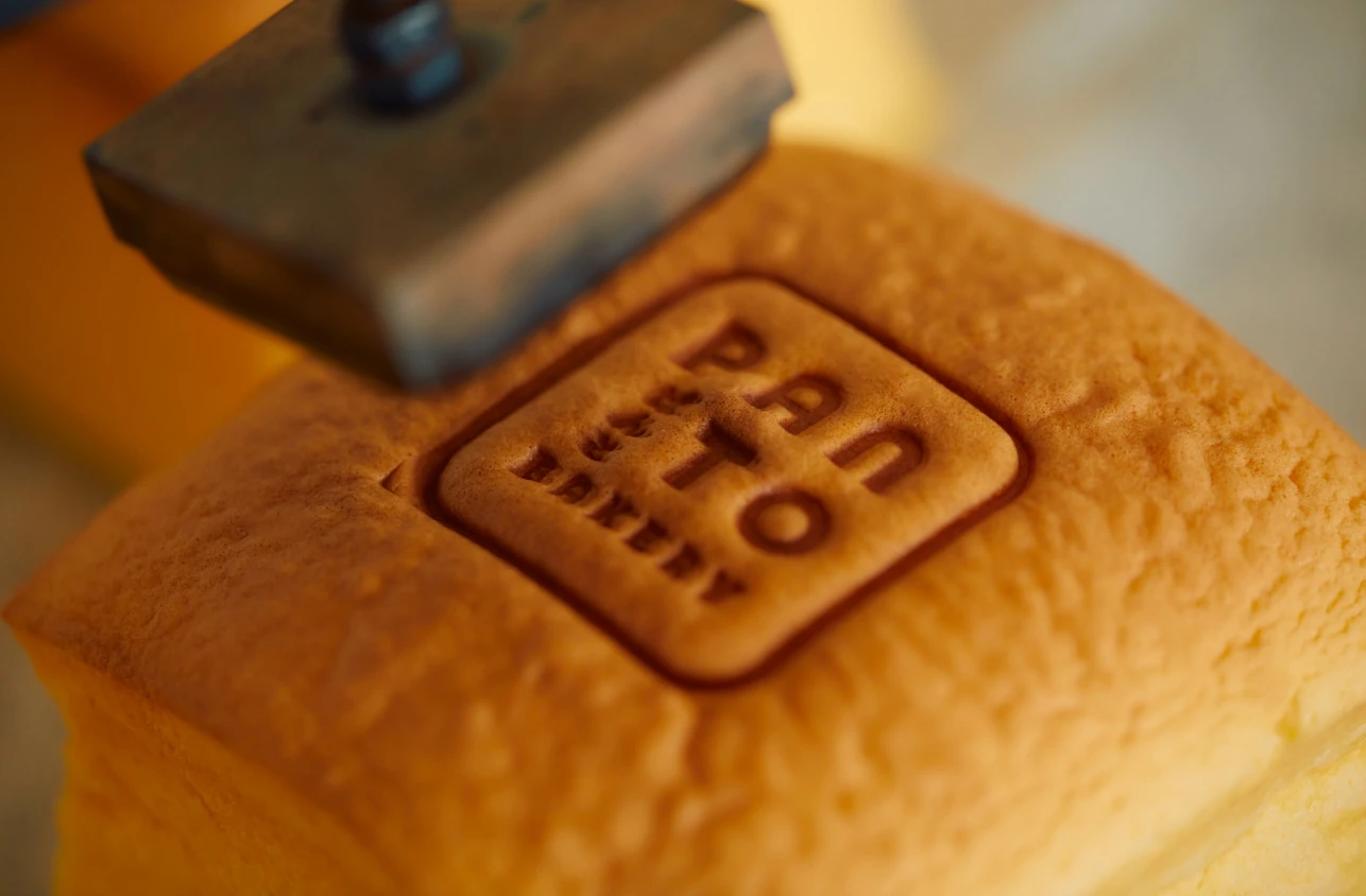
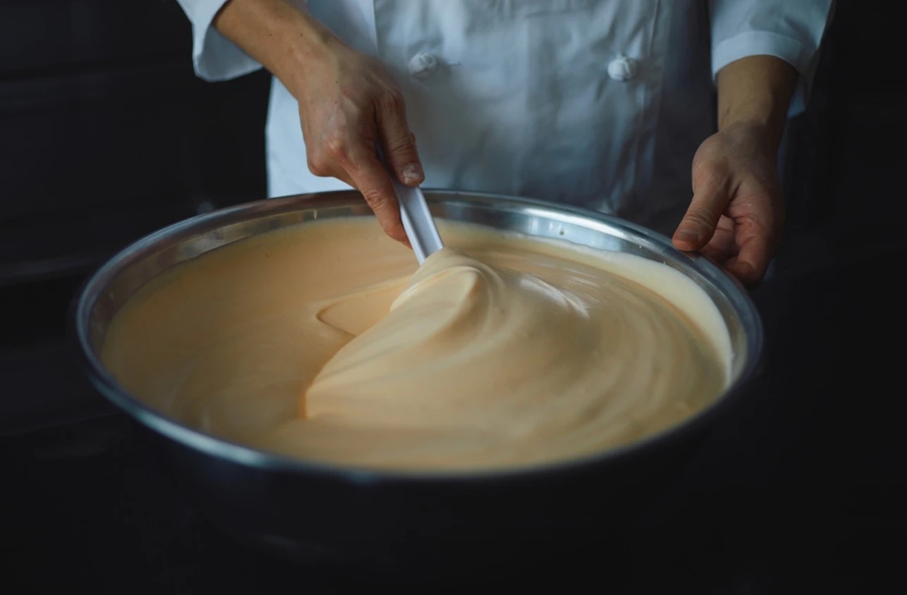
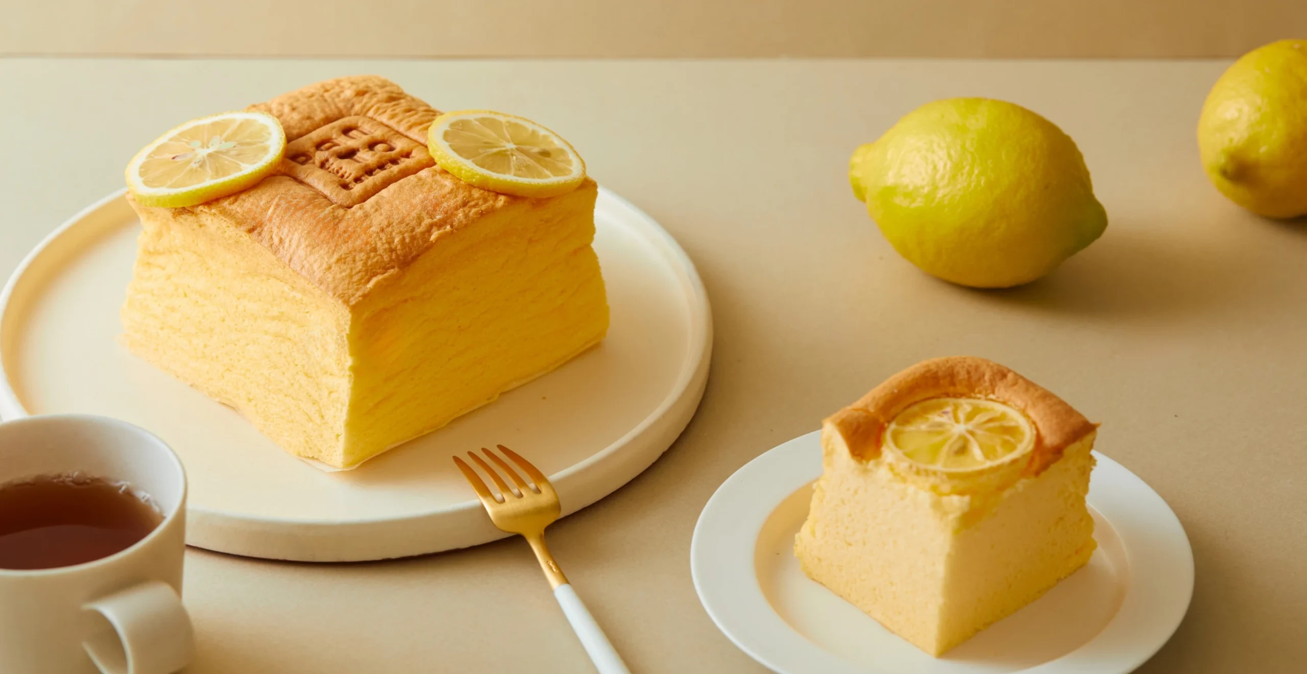
ロゴは、パンのフォルムをモチーフに、丸みのあるやさしいシルエットで構成。視覚的な親しみや安心感を大切にしながら、地域に根づいた店舗の空気感を反映しています。「パンを売る」ことではなく、「パンとともに、日常を編む」こと。PANTOというブランドには、そんな想いが静かに込められています。
The logo was designed using the soft form of bread as its motif, composed with rounded, gentle shapes. It expresses visual warmth and familiarity, reflecting the welcoming atmosphere of a store embedded in the community. PANTO is not just about “selling bread,” but about “weaving daily life together through bread.” That sentiment lies quietly at the heart of the brand.