PANTO
- BRANDING
- LOGO
- GRAPHIC
- PHOTOGRAPHY
SINCE 1996
 TOKYO, JAPAN
Close
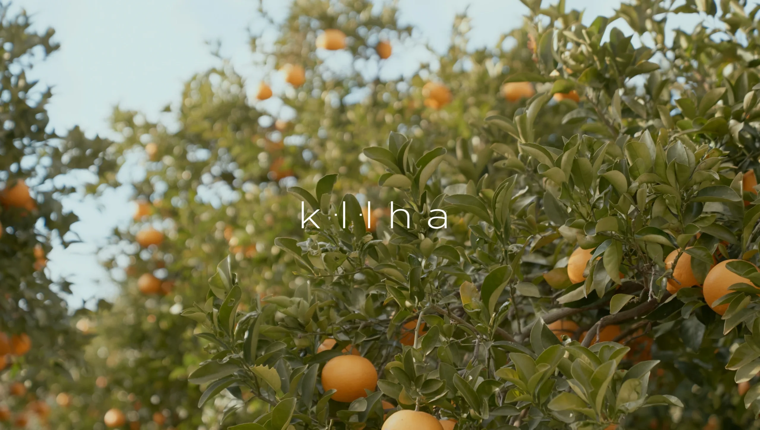
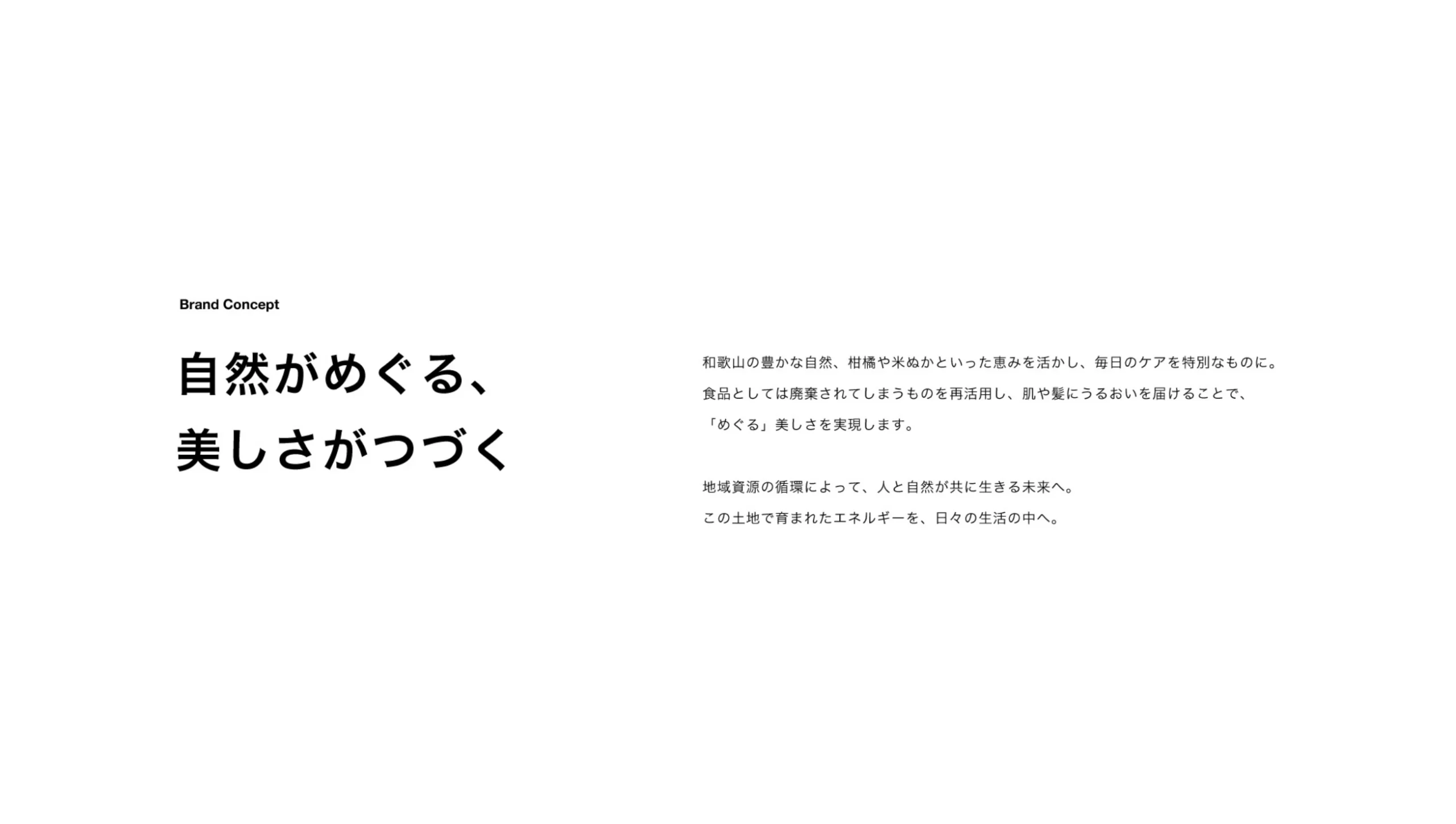
ZERO BRANDが展開する、和歌山発・地域資源を活用したスキンケアブランド「KIIHA(紀葉)」のブランドネーミングとステートメント開発を担当。ロゴデザインを含めたブランドの立ち上げフェーズに携わりました。
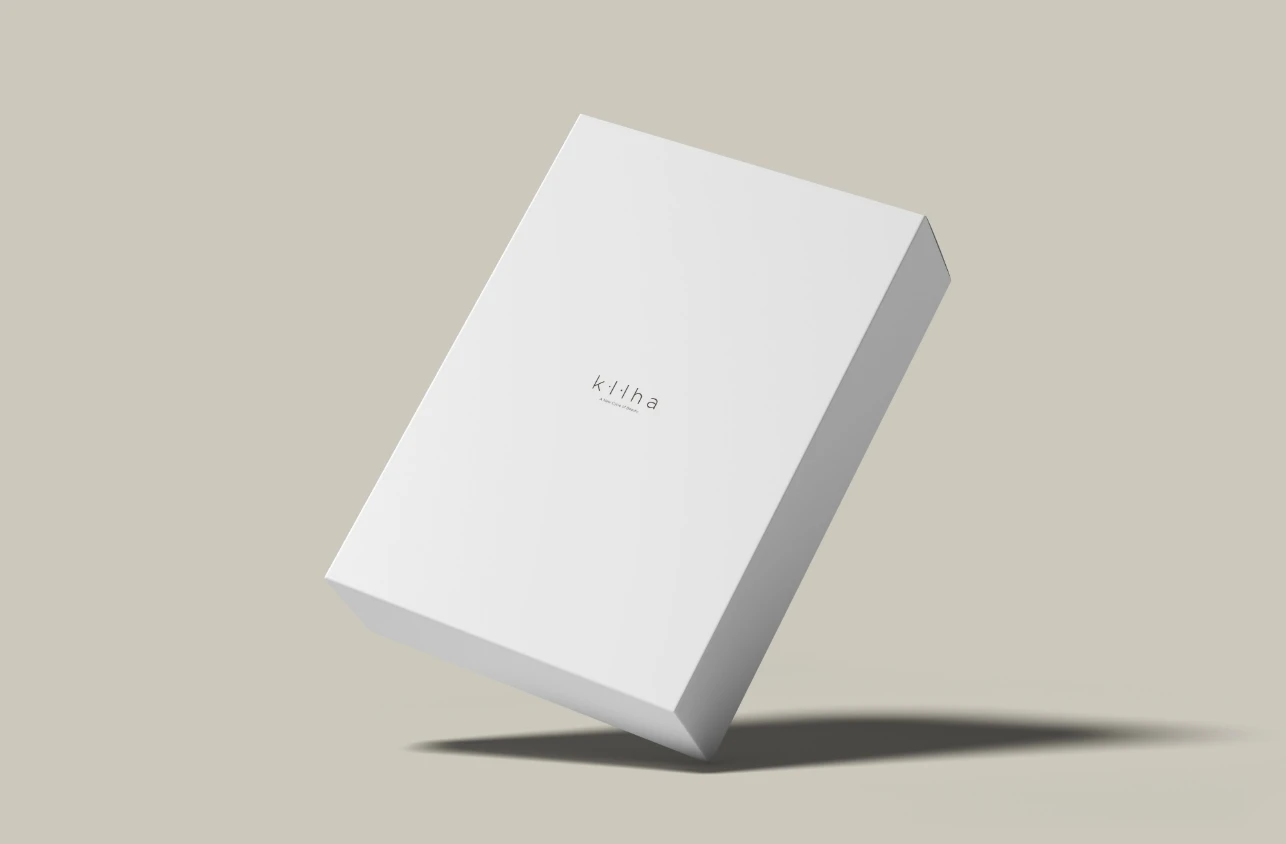
We worked with ZERO BRAND to develop the brand identity for “KIIHA,” a skincare brand rooted in Wakayama, Japan. Our scope included brand naming, storytelling, copywriting, and logo design. The result is a brand that quietly embodies circulation, connection, and natural vitality.
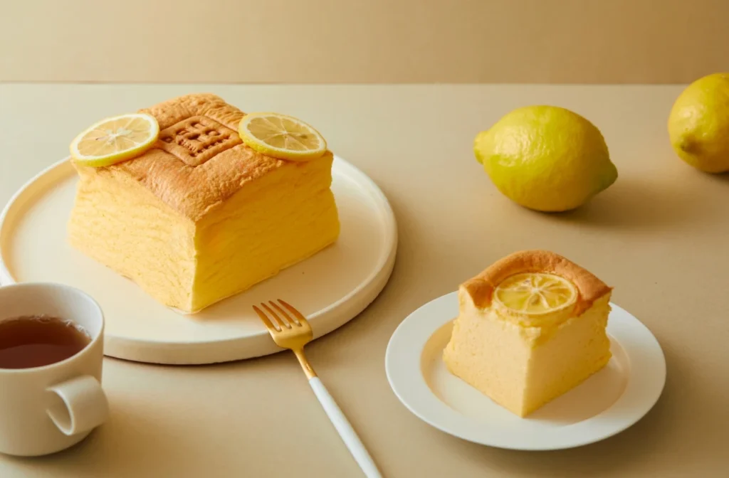
プロジェクトの出発点にあったのは、「肌や髪にやさしいだけでなく、自然環境にも持続可能であること」。
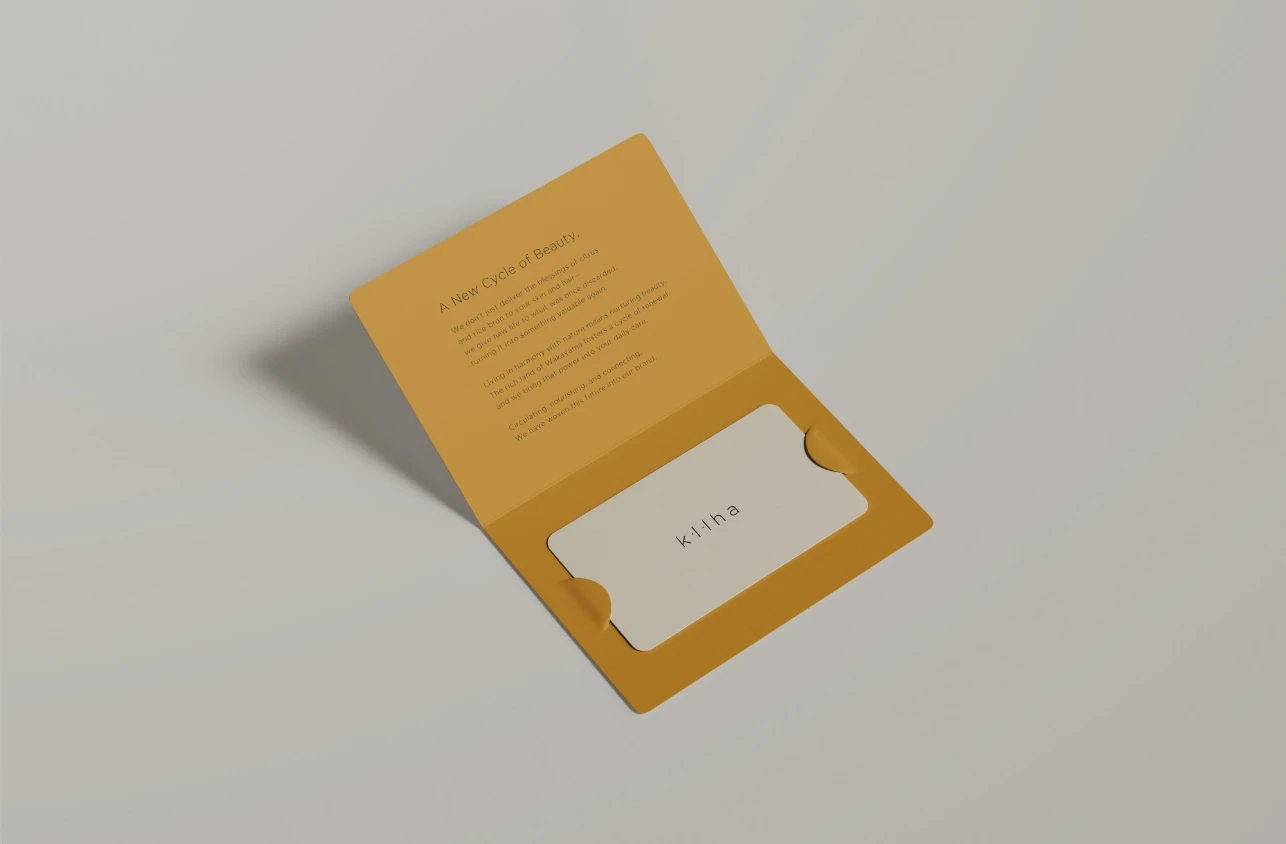
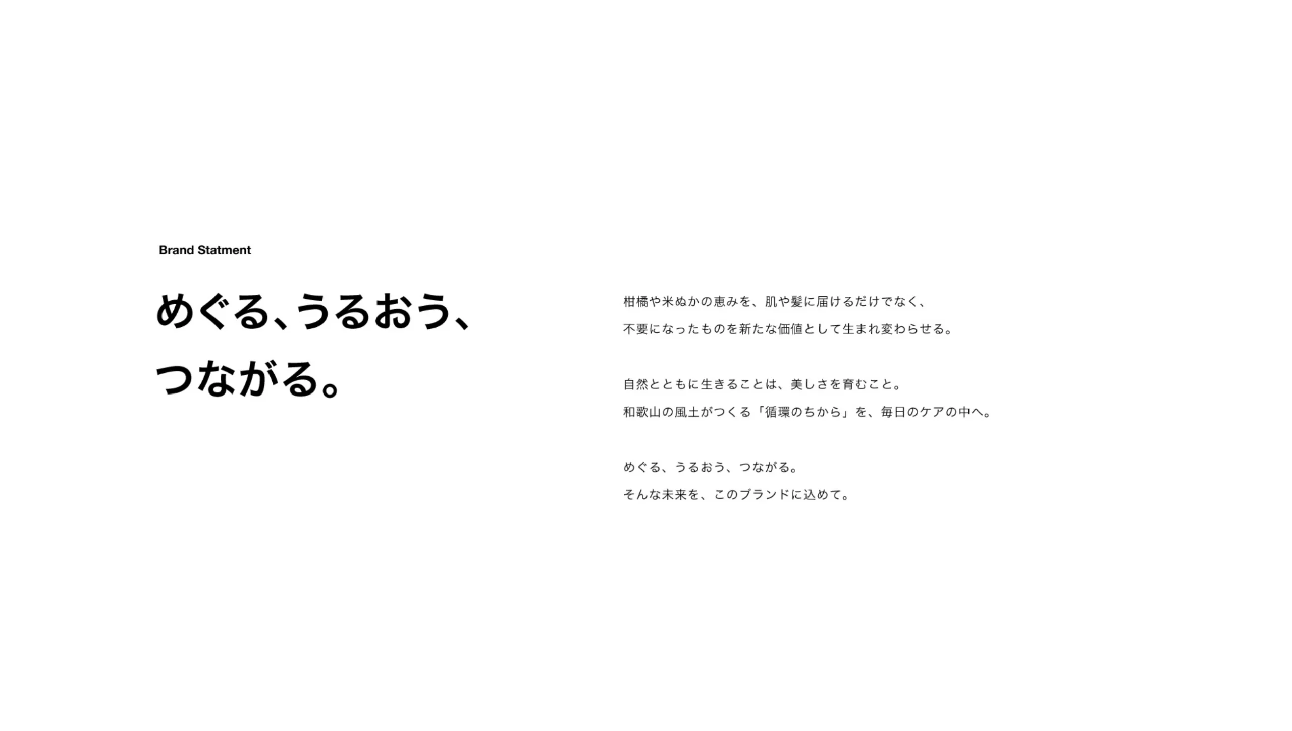
柑橘や米ぬかといった地域の副産物を活かし、自然の恵みが“めぐる”仕組みをつくりたいという想いからスタートしました。「KIIHA(紀葉)」という名前には、和歌山(紀州)の風土と植物の葉=“生命力”を重ね合わせ、地域性とナチュラルさを併せ持つ響きを目指しました。ブランドコピー「めぐる、うるおう、つながる。」には、ただ届けるのではなく、環境や文化、そして人の暮らしと共に循環するプロダクトであることを明示しています。自然と共に生きることが、美しさを育てていく。そんな“日常の中にある再生”を、静かに語るようなブランドトーンを全体で設計しました。
This project began with a simple, yet essential desire:To create skincare that not only nourishes the body, but also honors the cycles of nature and community. Using local resources such as citrus peels and rice bran—materials often discarded in the food industry—KIIHA aims to give new value to what already exists, and let beauty arise from that renewal. The brand name, “KIIHA,” blends “Kii” (Kishu, the region’s historical name) and “Ha” (leaf), expressing a connection between place, plant, and life. The brand copy, “Circulate, nourish, connect.” encapsulates a worldview in which beauty is not consumed, but cultivated through harmony with our surroundings.
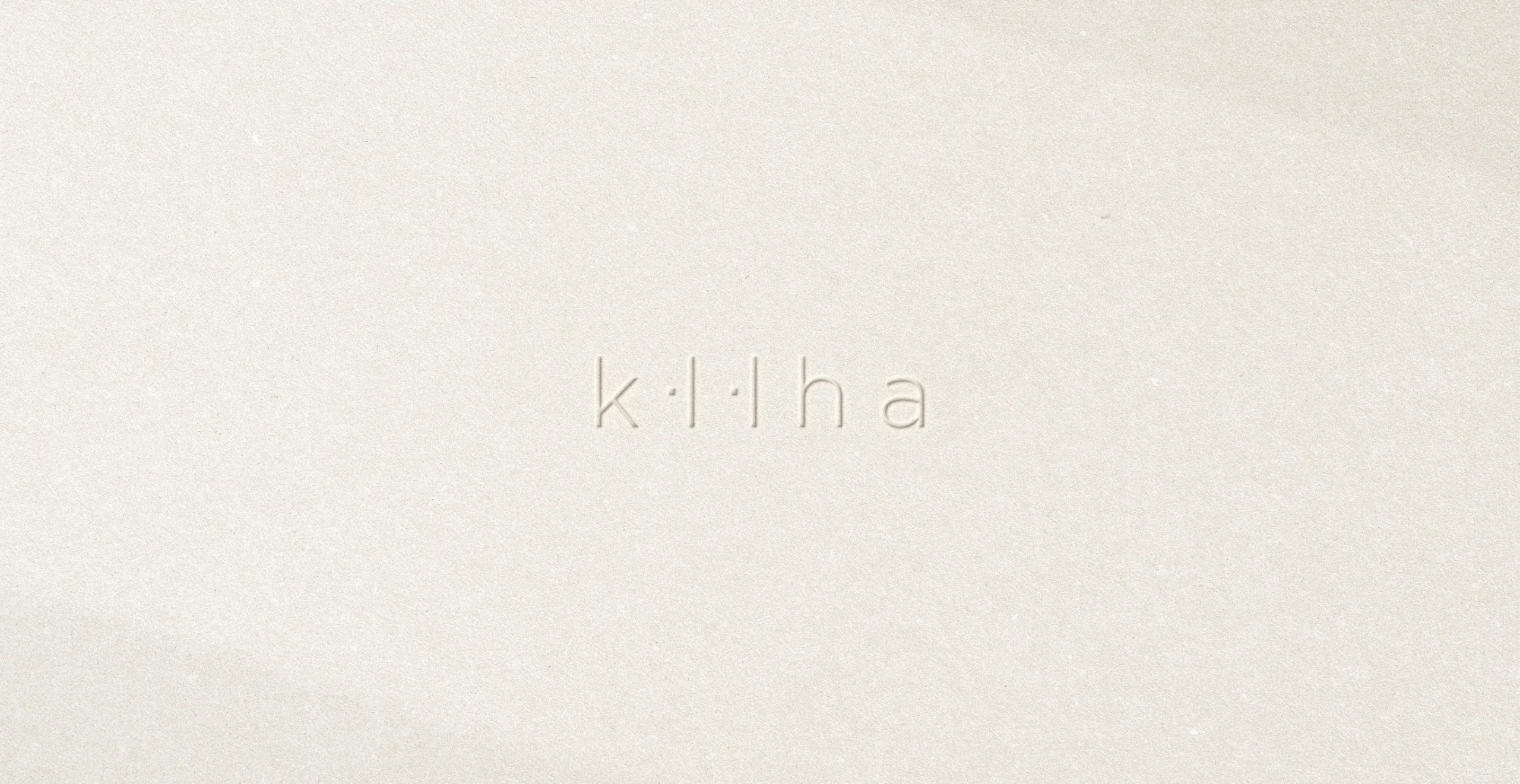
KIIHAのロゴは、「II(アイ)」の文字の中に、“州(しゅう)”のモチーフをさりげなく組み込んだデザイン。
「紀州」という土地を象徴する文字でありながら、「水に囲まれた土地=循環の象徴」でもある「州」の意味を重ねています。また、タイポグラフィ全体はシンプルで洗練された構成としつつ、一部に流れを持たせることで、オーガニックなやわらかさと独自性を両立。自然との共生、土地への敬意、日々に寄り添う美しさ——そうしたKIIHAの世界観を、ロゴにも丁寧に反映しています。
The logo integrates a subtle reference to the Japanese character for “Shū” (州), meaning “land surrounded by water,” embedded within the “II” of KIIHA. This not only reflects the local identity of Wakayama (Kishu), but also symbolizes flow, circulation, and connection—key ideas behind the brand. Its typography is deliberately minimal, with an organic rhythm that feels both refined and grounded. Rather than assertive symbolism, the logo offers quiet presence—like the product itself.