PANTO
- BRANDING
- LOGO
- GRAPHIC
- PHOTOGRAPHY
SINCE 1996
 TOKYO, JAPAN
Close
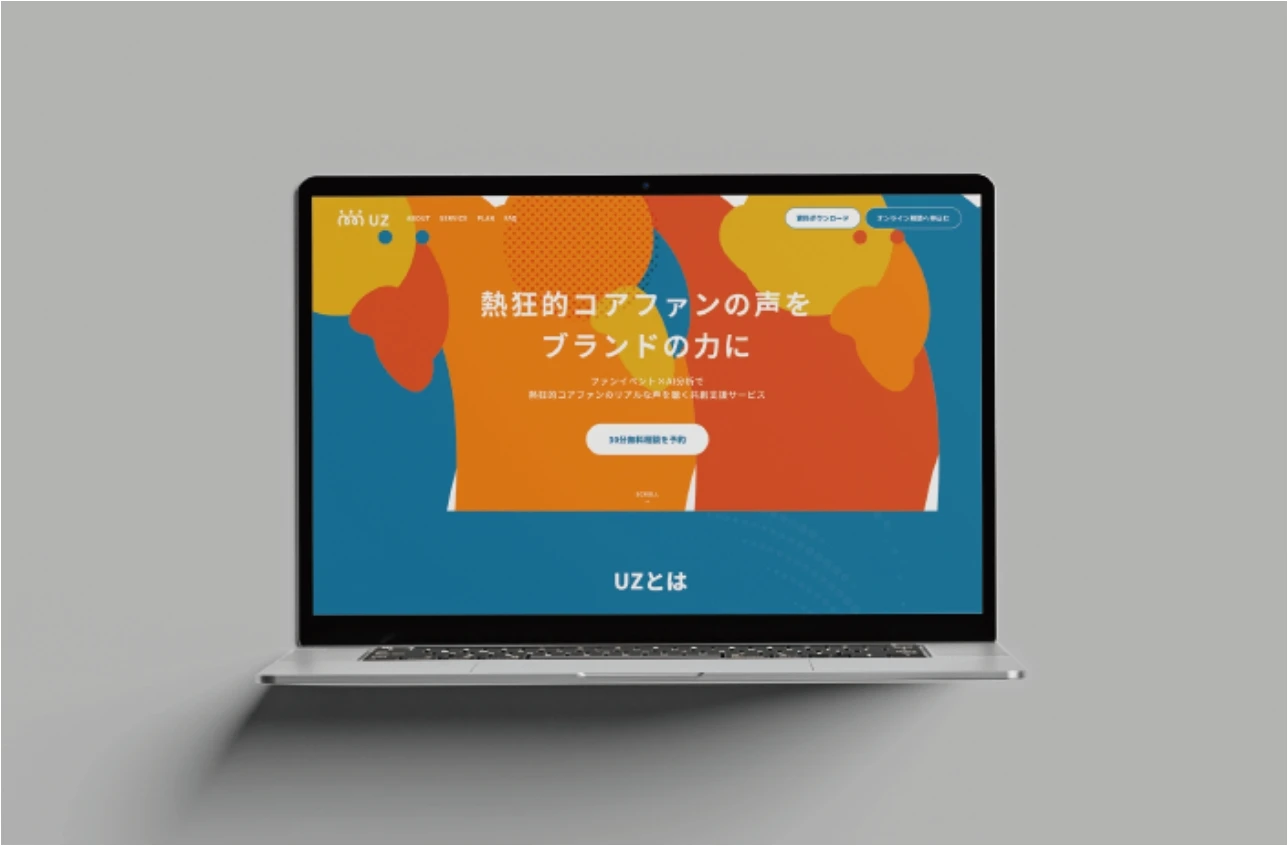
RiVA株式会社が展開するファンマーケティングプラットフォーム「UZ」において、ロゴ開発・ビジュアル設計・LPデザインを担当。熱狂的なファンとブランドが“共に並び、肩を組むような関係性”を、アイデンティティ全体に通底させる設計を行いました。
For RiVA Inc.’s fan marketing platform “UZ,” STUDIO G VOICE was responsible for the development of the logo, visual identity, and landing page design. The entire identity system was crafted around the core concept of “a brand standing shoulder to shoulder with its most enthusiastic fans.”
UZは、企業が一方的に発信するのではなく、ファンと肩を並べ、ともに盛り上げていくという思想のもとに生まれたサービスです。そのあり方自体がブランドの個性であり、最大の価値でもあると捉えました。
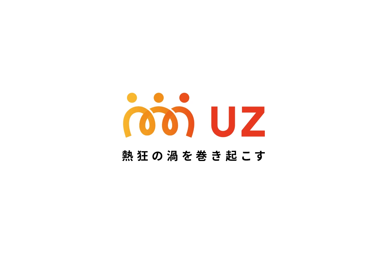
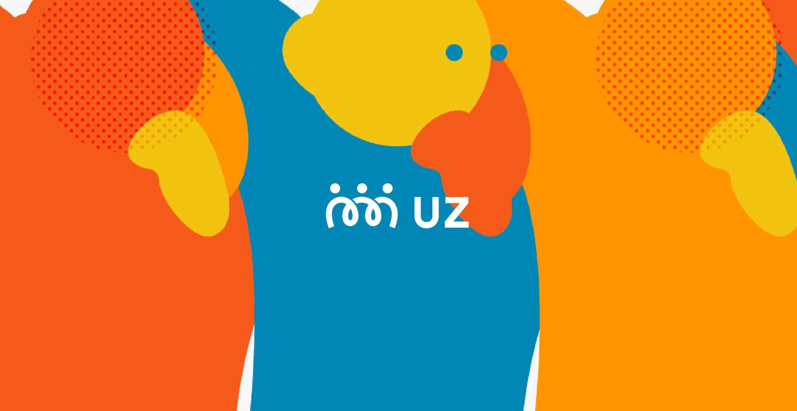
私たちは、プロジェクト初期から「熱狂的なコアファンとブランドが、円陣を組んでいるような姿をキービジュアルとして設定。ブランドの名が持つ“UZ=うず=渦”という語感を活かしながら、ファンとブランドの熱量が巻き込むように広がっていく様子を、ロゴ・グラフィック・LPのすべてに共通して組み込みました。
UZ was born from a philosophy where brands don’t just broadcast messages one-sidedly, but stand alongside their fans and build excitement together. We saw this collaborative stance not just as a communication style, but as the brand’s core personality and greatest value. From the early stages of the project, we set the key visual direction as “a huddle formed by passionate core fans and the brand.” Building on the phonetic meaning of “UZ” (a play on the Japanese word “uzu” meaning “swirl”), we incorporated the image of a growing vortex of energy shared between fans and brand into every layer of design—from the logo to graphics and the landing page.
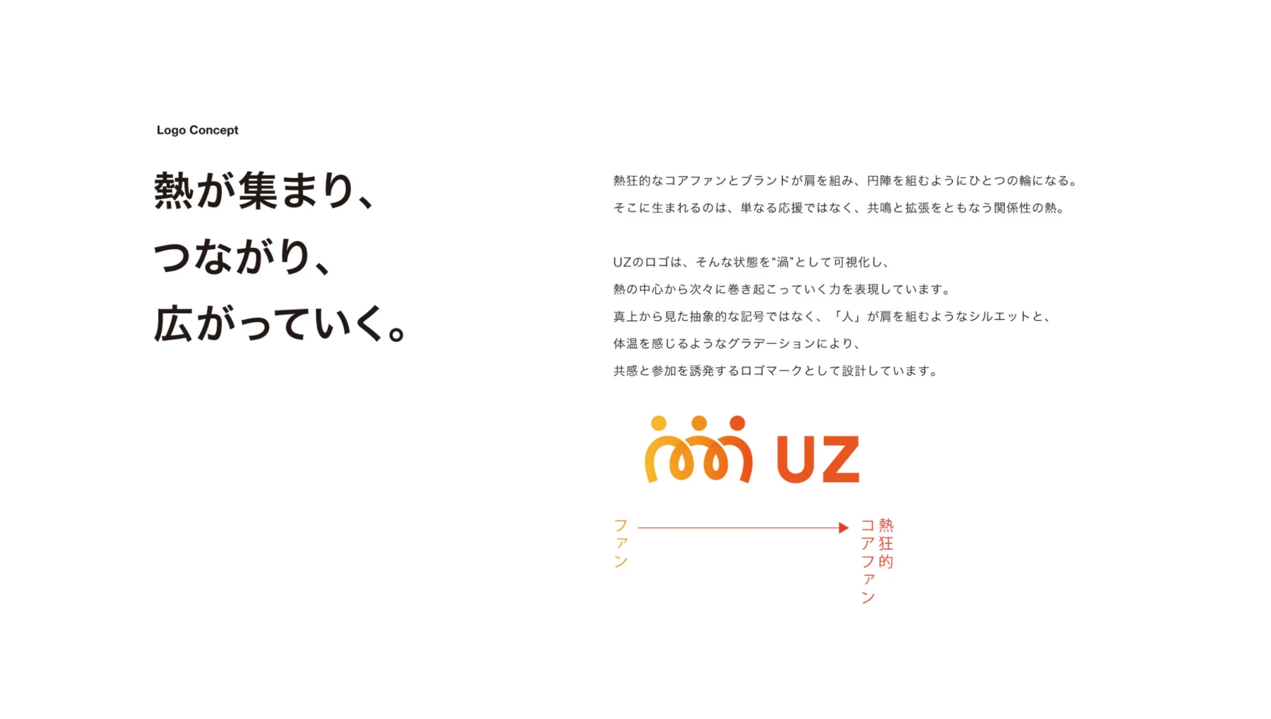
ロゴでは、複数の人が輪になって集まり、内側にエネルギーを高め合っている様子を象徴的にデザイン。図形としての“渦”ではなく、人が手を取り合い、肩を並べているような温度感を大切にしました。ビジュアルは、整いすぎない手ざわりや、動きのある曲線を使いながら、リアルな熱気とダイナミズムを表現。LPにおいてもその世界観を踏襲し、サービスの思想が言葉以上に伝わる構成とUIを設計しました。“ファンとともにあるブランド”という信念を、ロゴ・ビジュアル・UIのすべてに一貫して表現したプロジェクトです。
The logo depicts a group of individuals forming a circle, gathering their energy inward and building momentum together.
Rather than relying on a literal spiral motif, we focused on expressing a human warmth—a sense of hands joined and shoulders linked in solidarity. The visual language uses imperfect textures and flowing curves to evoke dynamic energy and real-life enthusiasm. That same worldview was reflected in the landing page structure and UI, allowing the brand’s philosophy to resonate beyond words. This project consistently expresses the belief in “a brand that exists with its fans,” across every touchpoint—from logo and visuals to the digital interface.